 |
| Violet Tendencies |
Way back in 2015 I posted
Creating with Photoshop on this blog. I wanted to share some of my work and my creative process. Since my photoshop chops have improved and I'm able to go a lot deeper with some of my work I thought I'd do an update and show some recent work. One thing I've realized is that when I'm doing this work, when I'm lost in the world of Photoshop, I feel that I am truly in the moment.
Sometimes it can be frustrating when I'm not able to get a look I want. Other times, going where I hadn't intended to go is better than I had originally envisioned. It's all part of the process. The results, most often, is work I'm very proud to call my own. The photos displayed here are from 2019 and 2020. The above photo is of Violet Tendencies from our Faces project, which was just a series of different looks, different faces. I knew when I was photographing Violet I would be playing around in photoshop. In fact every time I do a photo-shoot nowadays, I get excited about the possibilities of what I can achieve in Photoshop. A lot of times I don't have a specific thing in mind other than to just make something look cool. Sometimes it's just as simple as "let's see if this looks good". I'll add a texture and play with the colors etc. Sometimes I'll take some elements from other work I'm influenced by.
 |
| The original photo from the Faces shoot |
The Northanger Abbey poster was commissioned by
Noveltease Theatre for their adaptation of the Jane Austen novel
Northanger Abbey. The producers wanted a poster that resembled a gothic romance, 1960's style pulp cover. Because they knew of my pulp covers reproductions over the years, they asked me to do the photoshoot and create the poster. We shot at The University of Washington campus since there were many buildings that could capture that gothic feel. For the poster, I replaced the sky with some dark foreboding clouds and got rid of anything that looked too modern. The final poster is a composite of two photos. Whenever I do pulp covers I want to make the photo look a little bit like an illustration as best I can so I add treatments that best suggest that. For Northanger I also included the warn book cover look(check out some of my other
pulp cover work)
 |
| The poster for Northanger Abbey with Cheeky Diamondz |
 |
| The original photo |
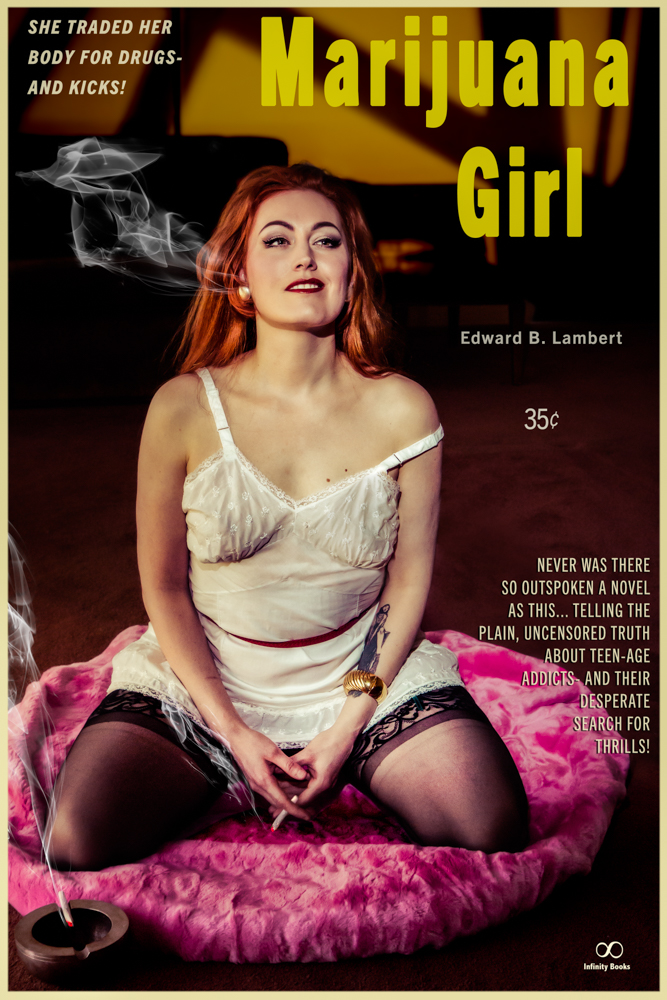
My friend Randi suggested we do a recreation of the
Marijuana Girl pulp cover, which was released way back in 1951. I wonder what the reaction was to this novel when people saw it on one of those revolving book racks at their local drug store. This one was probably only sold in the back of certain "adult" bookstores. I love doing recreation photo-shoots. It's fun getting all the elements together that best represent the set and design of the original illustration. For the shoot, I used a gobo pattern on the back wall to add some texture to make it a little more interesting.
 |
| Randi Rascal as Marijuana Girl |
 |
| The original cover from The early 1950's |
Some of my favorite creations are these from a photo-shoot last year with Frankly Frankie. These are both great examples of me not have any specific idea where I wanted to end up. Basically I just kept trying things until I really liked the way the photo looked.
 |
| Frankly Frankie |
 |
The original photo-I had shot this using blue and pink gels,
which I think looks pretty groovy |
 |
| I don't even remember how I got this look |
Sometimes I don't even use Photoshop to manipulate the elements of the photo. Adobe Lightroom is the program I use to download and organize all my photos. Over the years it has gotten more sophisticated as a tool to manipulate photos. One of the best things I like about it is the presets. You save specific parameters that you've adjusted as a preset which you can use for any photo. Sometimes the same preset won't look as good from one photo to the next due to the differences of lighting etc. But I can always apply the preset and make more adjustments and then save that as preset. It's never ending. The only problem for me is organizing all my presets in a coherent way. Here's a few examples from a photo-shoot with Katya Starin' back in 2019.
 |
| Katya Starin' |
 |
| Katya Starin' |
These days there are thousands of video tutorials on you tube where you can learn just about how to do anything. These next photos are results of different video tutorials I saw. Sometimes I'll follow the tutorial as laid out then tweak things here and there, sometimes even combining them with some of my own work flows. The first set is with Maggie McMuffin from 2019 and then Lily Von Trapp from 2020. |
| Maggie McMuffin looks dreamy |
 |
| the original photo |
 |
| Lily Von Trapp |
 |
| the original photo which already had been reworked in Lightroom |
I saw a photo that was turned into a stamp and wanted to do the same thing. I used a photo from my last photoshoot back in November 2020 with Olatsa Assassin. Olatsa agreed to be part of my on-going project of recreating some of the works of the Illustrator Robert McGinnus. I hope to have a number of recreations from his different works completed by the end of this year.
 |
| Olatsa Assasssin as a stamp |
 |
| This look of this photo was inspired by an old Robert McGinnus illustration |
 |
| wanting to get a letter press look |
Here are a few more photos with some Photoshop love
 |
| Frankly Frankie |
 |
| Maggie McMuffin |
 |
| Olatsa Assassin |
 |
| Violet Tendencies |
 |
| Frankly Frankie |
 |
| Daisy from 2019 |
 |
| Maya Papaya from 2019 in Oakland |
All photos © Paul O'Connel1


No comments:
Post a Comment